Grand Seiko First J14070
The weight of a First
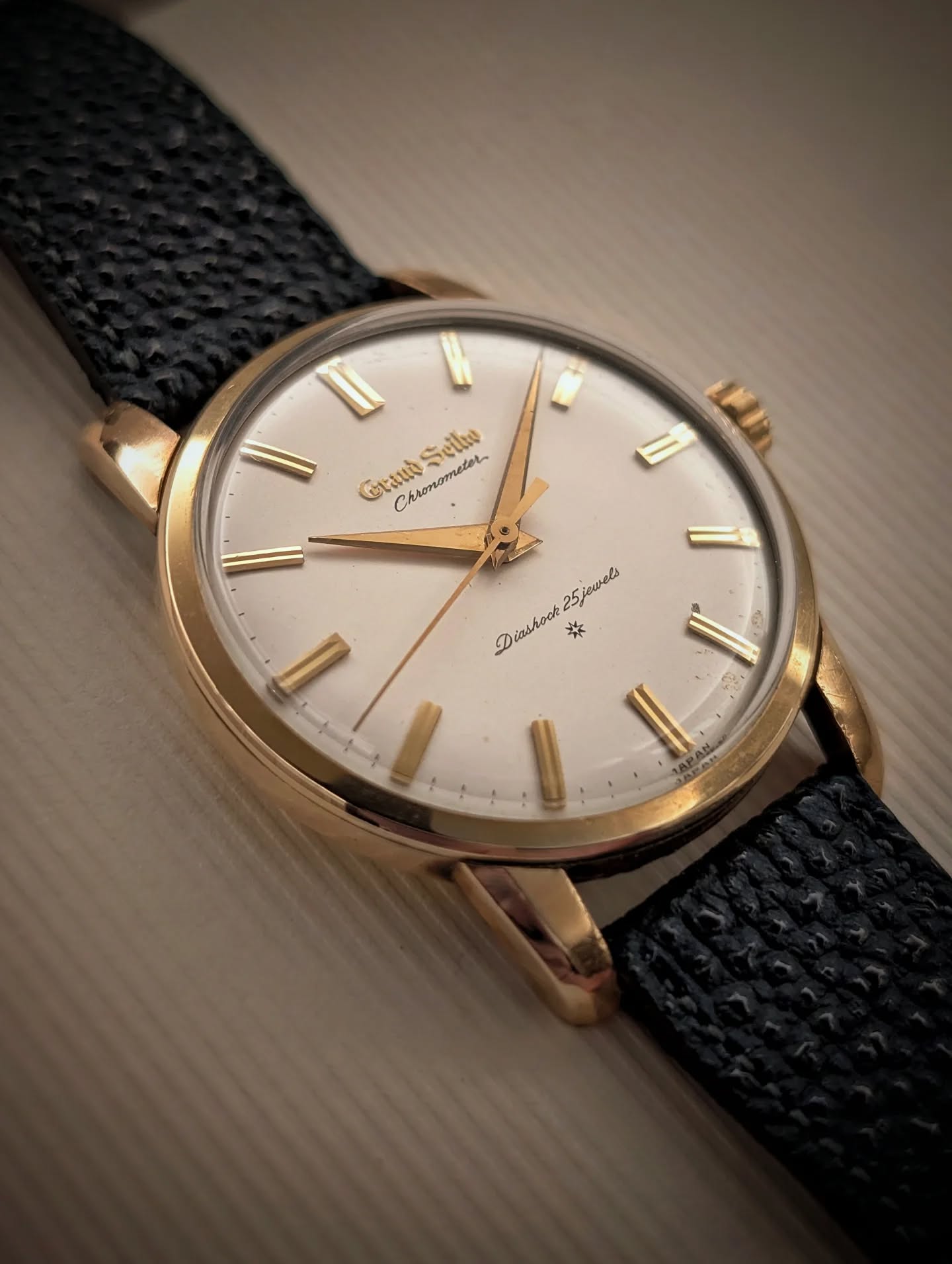
What struck me when this Grand Seiko arrived was its weight in the hand. It felt more substantial than its small dimensions had led me to expect. The rounded case and full edges contribute to that impression before the dial has even had a chance to explain itself.
Then the raised gold lettering catches the light. The gothic Grand Seiko name sits above an eggshell surface, accompanied by the double-ridged markers and fine Chronometer script. It is an unusually rich arrangement within such a compact face.
An eggshell stage
The quiet dial surface is essential to the effect. Its softness gives the gold letters and markers something to stand away from; their small variations in relief remain visible without a competing sunburst.
This is my raised-logo, SD-dial example with the later sword-shaped hands. At 34.9 mm wide, the real watch is considerably smaller than a close photograph tends to suggest. The precision of the letters and the delicacy of the printing make more sense when that scale is kept in mind.
Substance and ease
The winding action surprised me almost as much as the case. When I first compared it with my Lord Marvel and Crown, the Grand Seiko felt lighter to wind and did not develop the same pronounced resistance as the mainspring approached its full load.
That lighter winding action has made the First an easy watch to return to. Its relatively full case, 10.6 mm including the crystal, never feels merely ornamental.
The watch
| Reference | J14070 |
|---|---|
| Family | Grand Seiko First |
| Manufacture | Suwa Seikosha |
| Movement | 3180 · hand-wound |
| Beat rate | 18,000 vibrations/hour · 2.5 Hz |
| Case | Gold-filled |
| Case width, without crown | 34.9 mm |
| Thickness, including crystal | 10.6 mm |
Dimensions measured on this example.
The other First
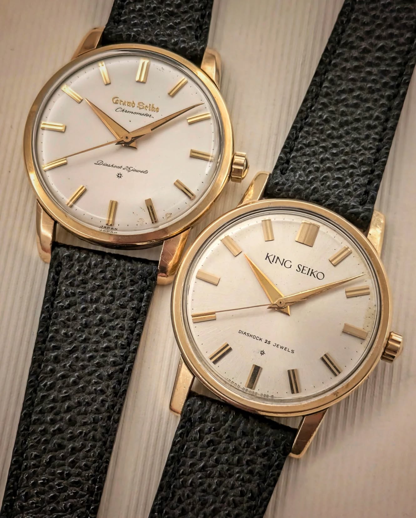
Placed beside the early King Seiko J14102E, the Grand Seiko’s fuller curves become much more apparent. The King Seiko draws its case and hands with a firmer, more linear edge. The Grand Seiko gives more room to rounded transitions and the decorative relief of its dial.
I enjoy the comparison because both watches are serious about proportion while giving it a different expression. Matching straps make the distinction particularly easy to see: the case, dial and hands have to carry the argument themselves.
The contrast continues at the crown. My King Seiko has a firmer ratchet and a more distinct click; the Grand Seiko winds more lightly, with a muted tick.
Before the broad planes
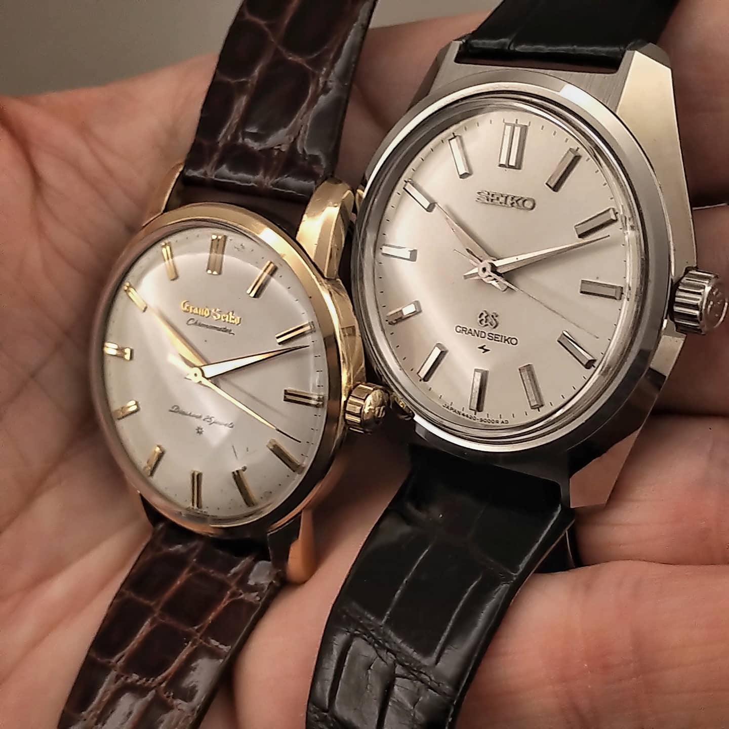
Beside the 44GS, the First seems to gather its detail into smaller reliefs: the bevel at a lug, the double ridge on a marker, the raised name on the dial. The 44 gives its broad, bright case planes much more of the work.
I find both equally satisfying to look at. The comparison shows how far the balance between case and dial could shift within Grand Seiko, while proportion remained the common concern.