
The Seiko Style
origin story
How Grand Seiko’s defining shape found its edge in King Seiko
The steel 44GS is the centre of my vintage Seiko universe. To my eye, it is an absolute masterpiece of watch design. What I find less often illuminated is where that mastery took shape. When I follow the design back through the watches themselves, the early King Seiko line emerges as its formal laboratory: the place where I see the surfaces, volumes and junctions of what we now recognise as Grand Seiko Style being worked out, watch by watch. The steel 44GS brings those explorations into a whole of extraordinary clarity, and gives me the point from which to read everything around it.
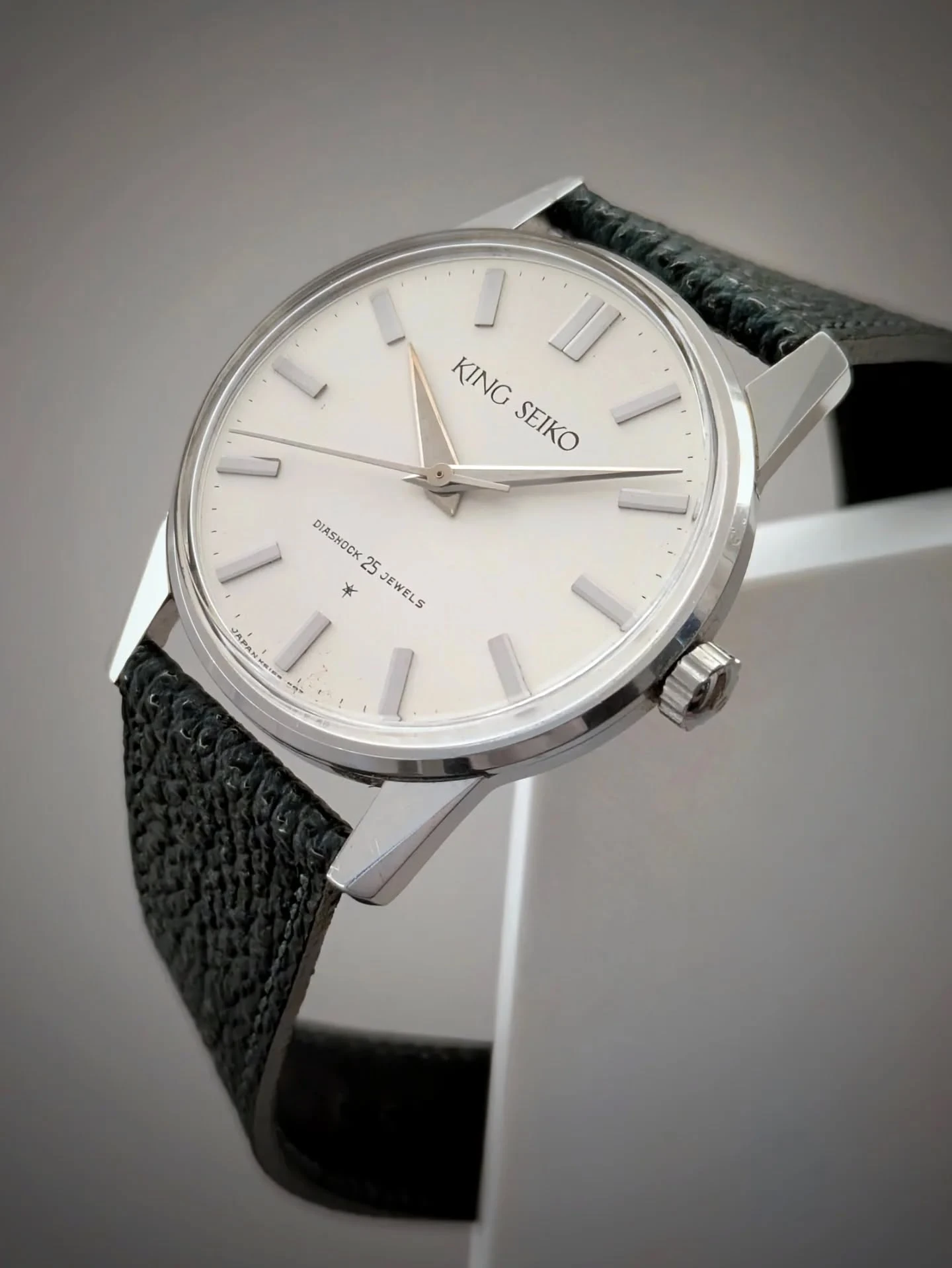
I remember coming across a steel J14102E in a Japanese shop when the early King Seiko portfolio was still a blur to me. I had never seen one of these Firsts before. Something about it stayed in my head. It remained available for quite a while, and eventually I gave in and ordered it. My initial reservations about a watch without seconds hacking soon gave way to an affection for its dogged precision, its strong little movement and, above all, the conviction of its shape.
My curiosity and enthusiasm about the J14102E led me to acquire more watches from the early King Seiko line. When I put them next to each other, a remarkably coherent sequence began to emerge. Details I had initially understood as the individual character of a particular reference started to look like successive answers to the same design questions. How should the case meet the lugs? How much volume should an index have? Where should a reflection stop? What happens to the whole watch when a line moves by a fraction of a millimetre?
This is the story I read in those objects. I approach it as a designer and as someone who has collected, worn, photographed and compared them. The watches themselves are my starting point. Their proportions and junctions let me follow how that visual language gradually came into focus.
And when I follow that language back from the 1967 steel 44GS, it takes me straight into the King Seiko line of the early sixties.
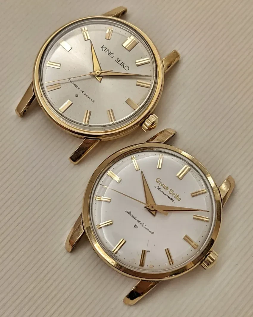
Two Firsts
Two Firsts and two different temperaments
Putting the first Grand Seiko beside the first King Seiko is a particularly revealing place to start.
I have a deep affection for the Grand Seiko First. Its rounded case, richly worked markers and delicate dial give it a thoroughly satisfying presence. There is a certain generosity to it, a sense of a familiar kind of fine watch being brought to a very high level of accomplishment. Even the experience of winding and setting it has a delicacy that fits its appearance.
The King Seiko speaks with a different accent.
There is already something unusually direct about its flat dial, straight hands and upright geometry. The round case remains recognisable, and the lugs are still clearly attached to it, but the surfaces are beginning to insist on a more abstract reading. The eye encounters planes and edges with a clarity that makes the Grand Seiko seem softer and more nostalgic by comparison.
Both watches are beautiful. What matters to this story is the difference in their formal ambition.
The Grand Seiko First gives me a refined version of an established language. In the King Seiko First, I can see the beginnings of a language being questioned and rebuilt. That distinction becomes much more consequential as the watches develop. The most compelling route to the 44GS does not remain neatly inside the Grand Seiko catalogue. It crosses the boundary between the two names.
This is why I find the early Kings so important. Reading them only as a second tier of premium Seiko misses a great deal of what is happening in their design.
Taro Tanaka’s later account describes a pursuit of flat planes and clear, undistorted reflections. It helps me recognise the direction of change without mistaking the 1961 First for a finished set of rules. More on Tanaka, his team and the project’s name
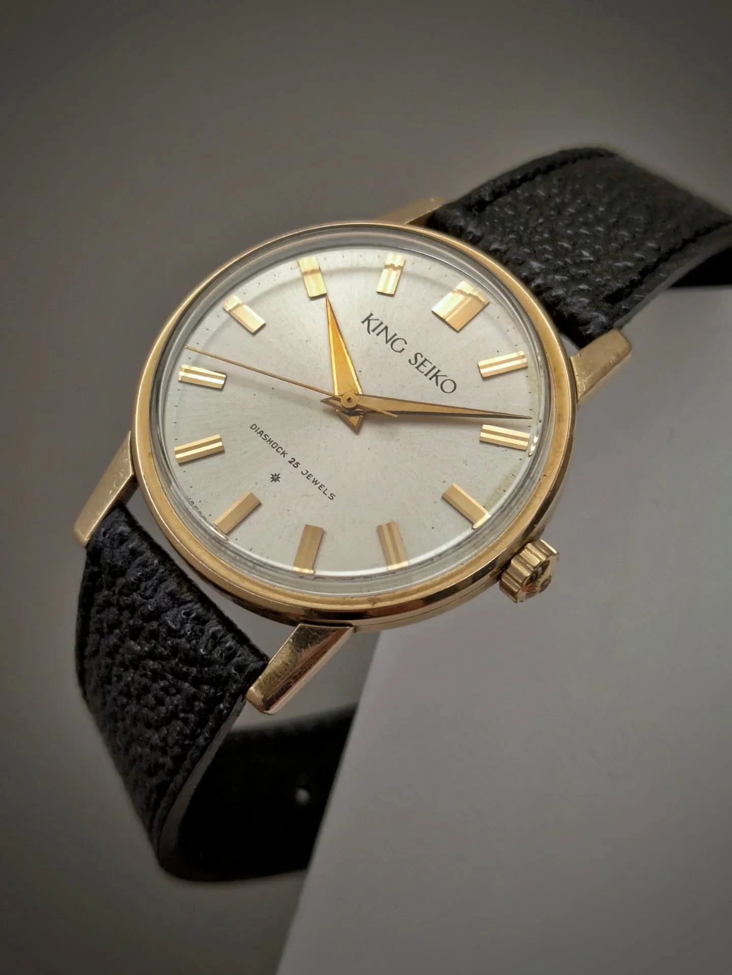
J14102E · flatness
The J14102E and the consequences of flatness
The J14102E gives us the essential starting proposition: flatness. As Seiko’s first wristwatch with a flat dial, it makes a decisive break with the domed faces of its predecessors. That new plane gives the rest of the watch a clear point of reference.
Look at the dial, then at the sword hands above it, the top of the crystal, and the polished planes of the lugs (sometimes gold-filled). These elements begin to reinforce one another. The watch has acquired a clear geometric premise that extends across its component parts.
Flatness changes how light behaves. A rounded surface gives us a moving band of reflection. A polished plane can appear bright and then almost black as the watch turns, with an edge marking a decisive change between one surface and the next. That makes the geometry legible, almost tangible. The watch comes alive through the relationship between its surfaces.
On the steel watch, this relationship between geometry and finish becomes particularly clear. It belongs to the wider pursuit of surface control made possible by techniques such as Sallaz polishing, known in Japanese as Zaratsu: broad, even planes meeting at sharply defined edges.
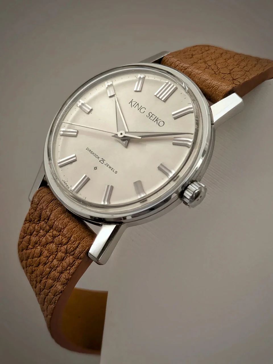
A circular outline can still belong to this language. The case is cylindrical; the significant difference lies in the discipline of the surfaces and their intersections. A curve in plan and a softened, swelling volume do very different things to the eye.
The J14102E has not yet taken this idea all the way. Its folded markers retain something of an older, more ornamental vocabulary, and the distinction between round case and projecting lugs remains quite explicit. You can see the components of the future language without yet seeing its final synthesis.
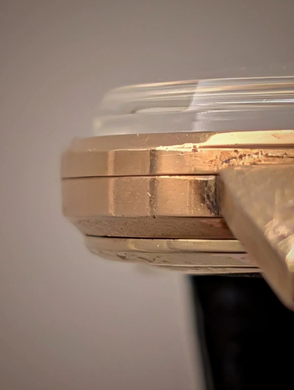
There is also a lovely piece of practical, visual intelligence underneath the watch.
Follow the vertical alignment of bezel and case flank. If that wall simply continued down to the bottom of the caseback, the result would look surprisingly heavy. The apparent purity of the idea would make for a rather inelegant profile.
Instead, the underside is carefully relieved. The caseback curves up towards its perimeter, while coordinated chamfers on the case and back reduce the amount of vertical flank that remains visible. The lower edge of that flank lands just below the crown axis. Above it, the watch presents a firm, upright face; below it, the geometry quietly withdraws.
I find this wonderfully clever. The designers understand the consequences of their own premise and know where to temper it. An uncompromising appearance can depend on some very well judged compromises. That ability to keep the idea clear while making the object work is already present here.
15034 · abstraction
The 15034 and the moment the voice becomes clear
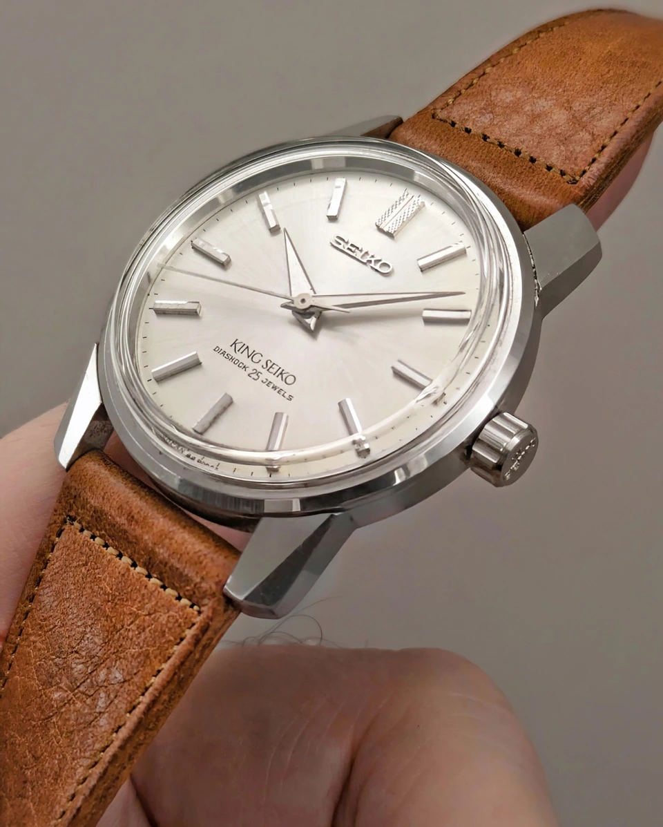
The next King Seiko First, the 15034, deserves much more attention than it generally receives.
When fellow collectors asked which vintage Seiko marked the moment the company found its own voice, this was my answer. The J14102E announces the direction. In the 15034, I feel that the conviction has become unmistakable.
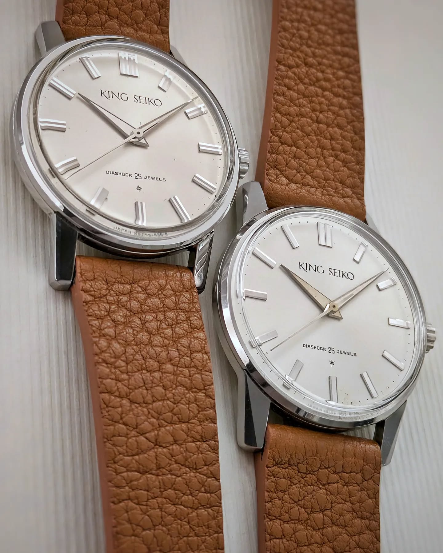
The markers lose their ornamental folds. Their simpler surfaces belong more naturally to the flat dial and hands. The lugs become more assertive, and their facets begin to do something more interesting than merely soften an edge. The cuts develop their own geometry, like the facets of a very restrained diamond.
Watch the outer sides of those lugs in particular. They are beginning to reach towards a tangent relationship with the cylindrical case. The gap between “a round case” and “the things attached to it” is starting to close.
The round body is still there, and the lugs can still be read as separate forms. But they are beginning to negotiate a common outline. That is the small movement I want the reader to notice, because it will become decisive in the 44GS.
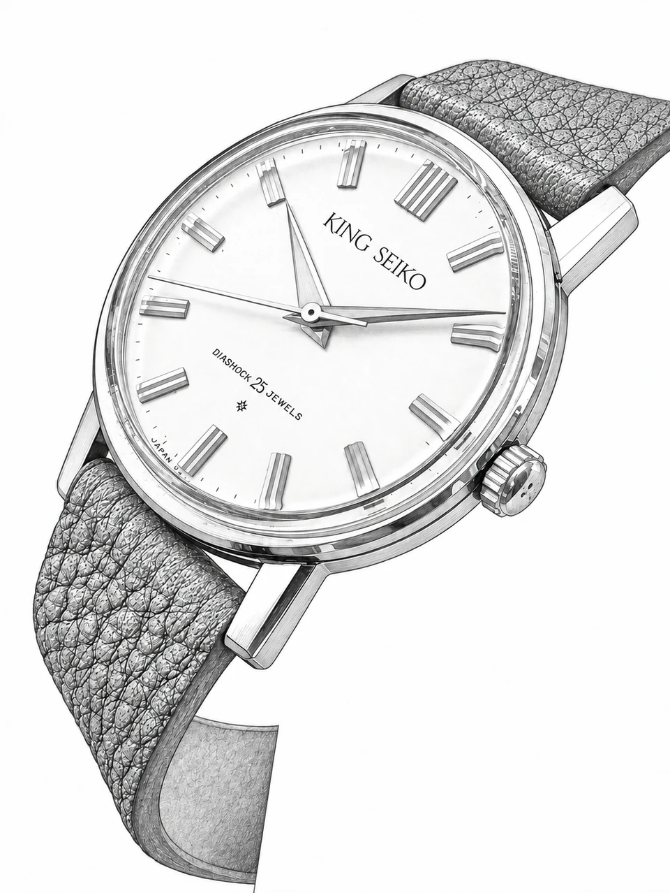
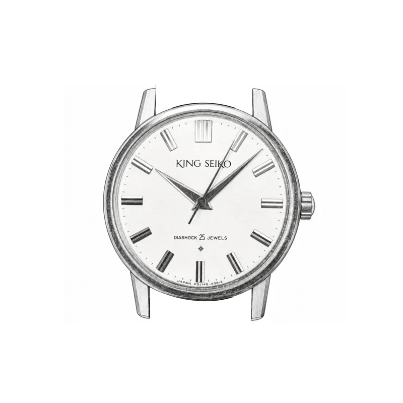
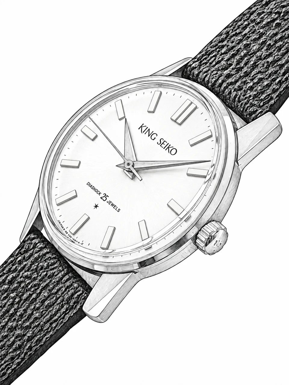
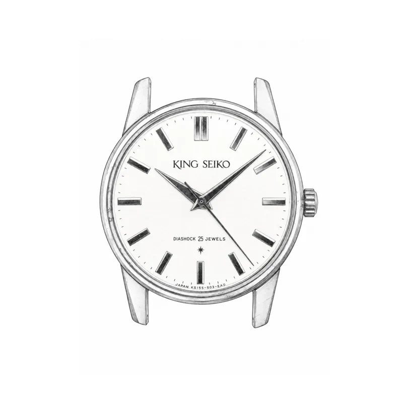
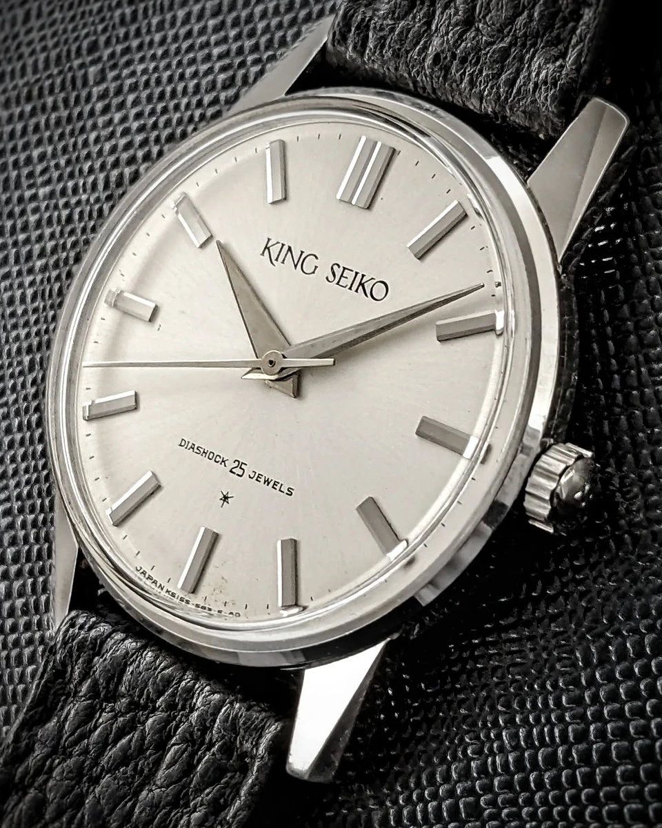
There is a comparable economy on the dial. One basic marker is repeated around the perimeter, with a double marker at twelve. That doubled element gives orientation without introducing a completely new kind of shape or scale. The eye can read the rhythm quickly, while the individual markers remain clear objects in their own right.
I have called this an escape from “size pollution”: the visual noise of too many competing sizes, with too little distinction between them. A small vocabulary of well-chosen, clearly different sizes, repeated consistently, gives the eye a calm, restrained landscape. Very little is needed, provided the relationships are right.
The character of a lug, an index or a bezel depends partly on what surrounds it: its size in relation to neighbouring forms, and how clearly those differences can be read.
The 15034 is a marvellous little demonstration of that sensitivity. Its abstraction has an almost unreasonable force for such a quiet watch.
44999 / 44-9990 · volume
Giving the language volume
With the second-generation King Seikos, the experiment becomes much more physical.
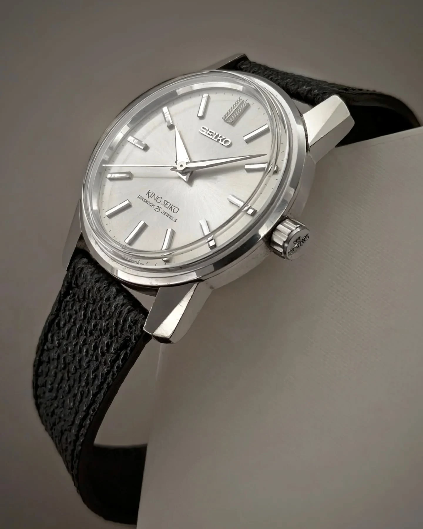
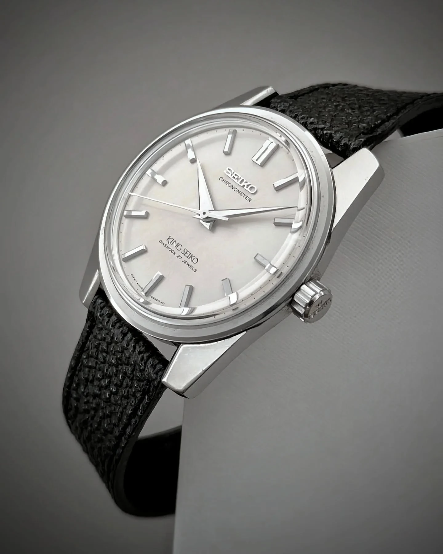
The 44999, later designated 44-9990 and often called the KSK, takes the vocabulary of the Firsts and gives it a healthy dose of steroids. The lugs become wonderfully beefy. The crystal rises above the case. The markers stand up from the dial with a confidence that makes the whole watch feel almost architectural.
The significance is in the coordination. The increased mass of the lugs is answered by the volume on the dial and the height of the crystal. The watch has gained depth as a composition. Turn it slightly and the facets begin to flash, while the raised markers cast shadows across the dial beneath them.
The idea of making a watch sparkle through clearly defined surfaces becomes very tangible here. There is no need to imagine what those surfaces might do. Move the watch in your hand and they demonstrate it.
I once received an exceptionally sharp early 44-9990 whose lug edges felt as though they could almost cut me. A well preserved example makes the intent astonishingly clear.
 15034
 44-9990
Across these early Kings, however, I keep seeing the same concern: make each element more legible as a volume, and make those volumes work and play in the light together.
KSCM · integration
The King Seiko Chronometer
The King Seiko Chronometer is the crucial bridge in my reading of the story. My only example is a steel 4420-9990 Mk II, and it is this watch I put beside the steel 44GS to examine the final transformation.
There is something quietly forceful about the Chronometer. It has the height, flatness and substantial markers of the early King Seiko language, but its mass feels differently organised from the emphatic KSK. The lugs have broadened towards the case, and their outer lines come close to a tangent relationship with the round body.
By this point, much of the groundwork is already in place. The traditional case is beginning to disappear into the substance of the lugs. We are close enough to the 44GS that a surprisingly small rearrangement of lines can produce a very large change in the identity of the object.
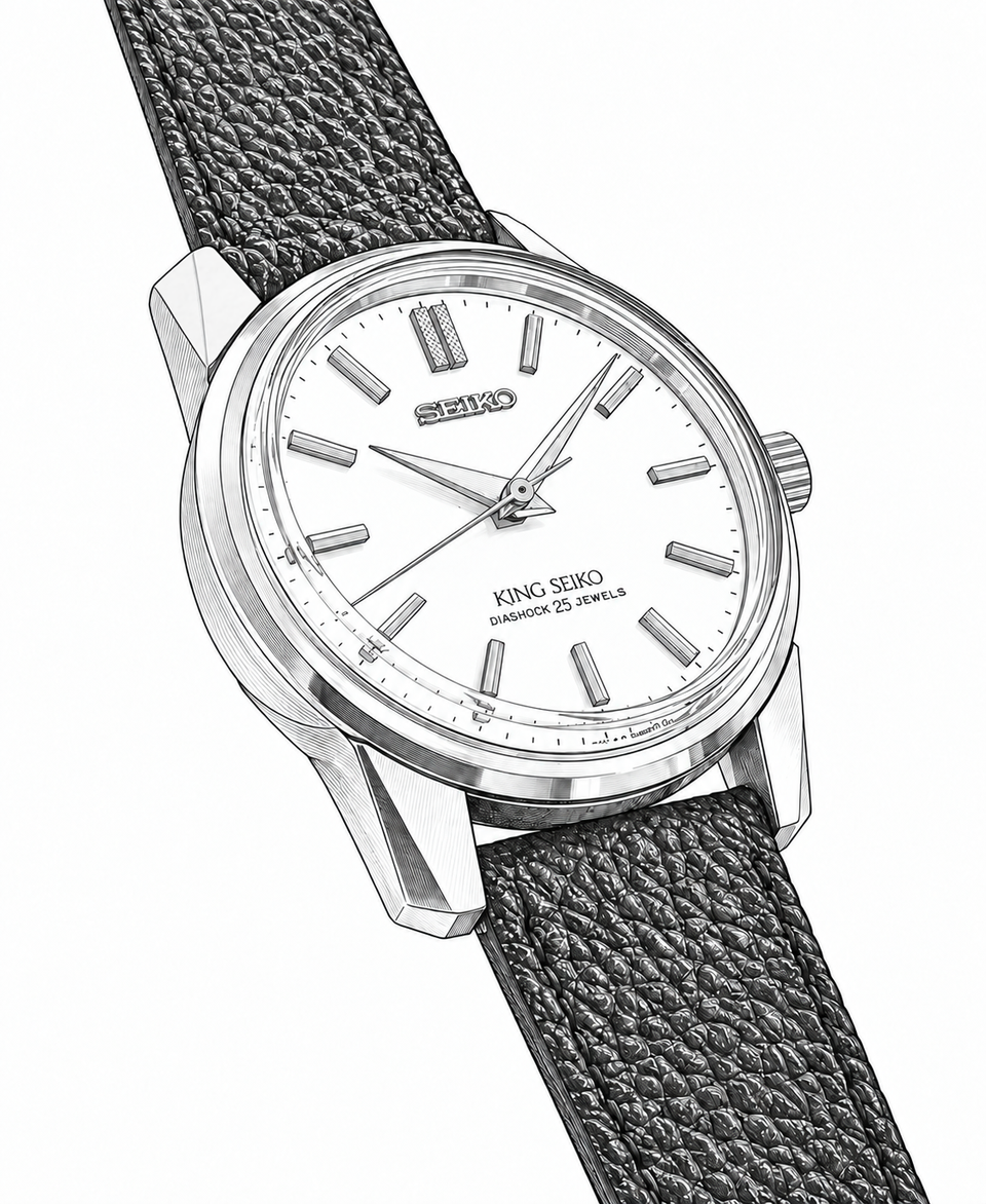
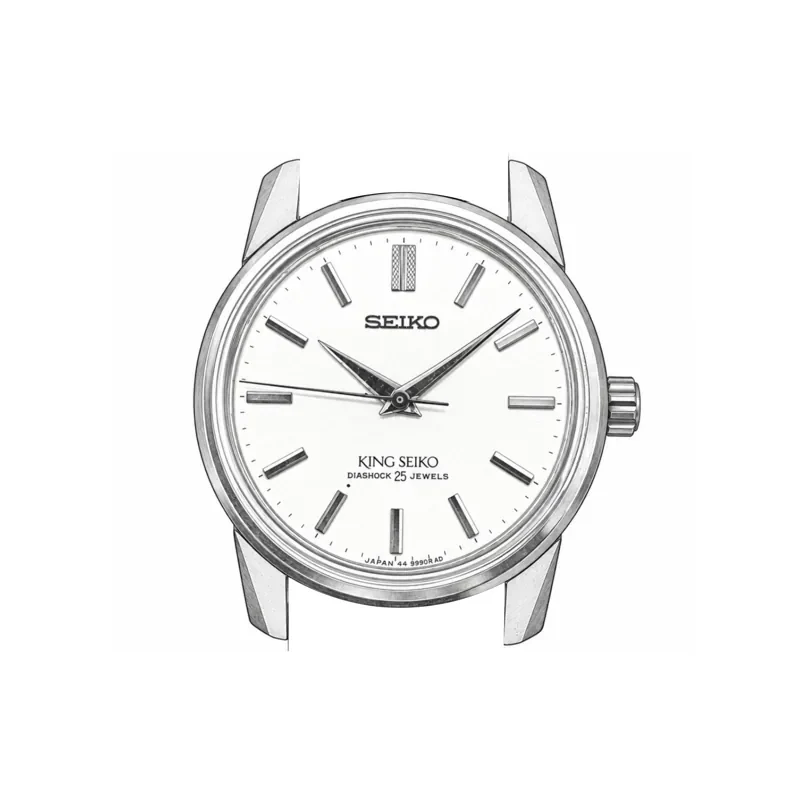
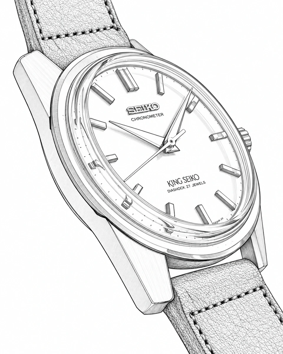
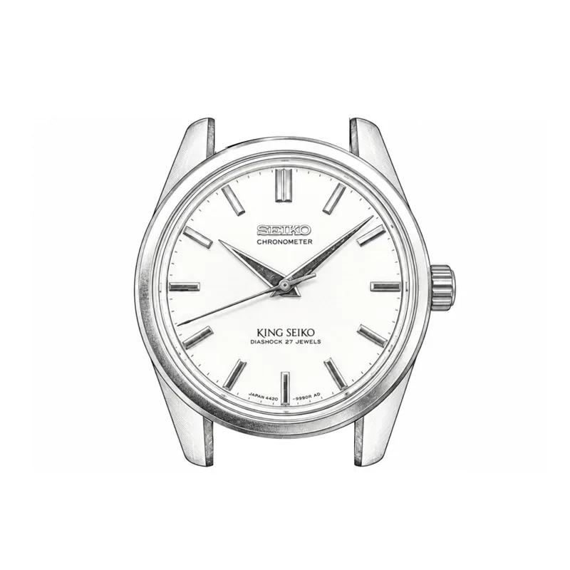
For the particular development I am following, the King Seiko Chronometer gives the clearest view of what happens next.
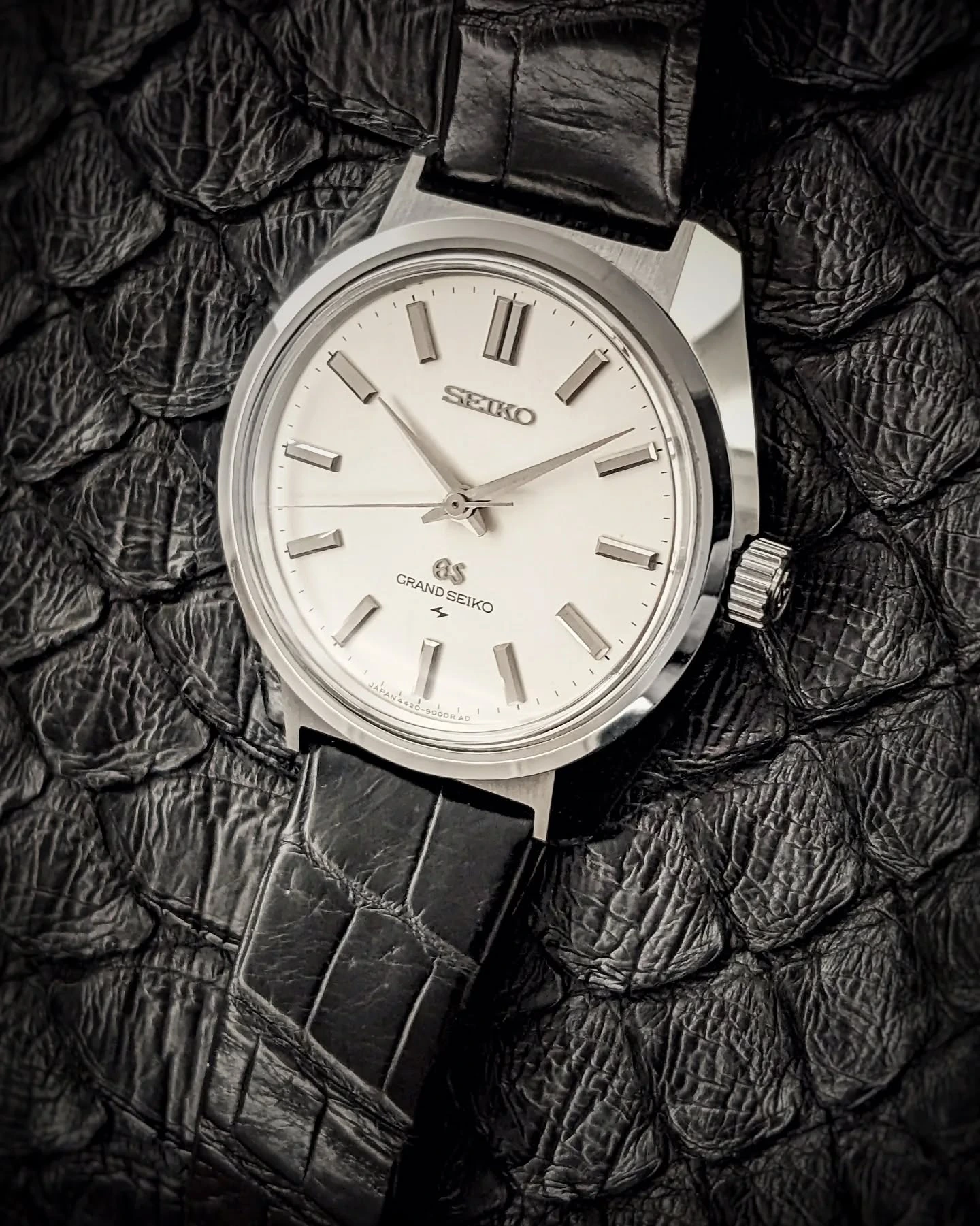
44GS · 4420-9000 · synthesis
The fold that changes the whole watch
Put the King Seiko Chronometer beside the stainless steel 4420-9000 and look at their profiles.
On the King, the side edge of the lug still belongs primarily to the lug. On the 44GS, that line has moved down and continues across the side of the case, joining one end to the other. The case gains its characteristic horizontal fold, while the lower flank retreats inwards towards the caseback.
The concern is already familiar from the J14102E, where the underside withdraws to keep the upright case from looking heavy. In the 44GS, that retreat becomes an expressive part of the case itself: the inward slope gives the horizontal fold its tension while reducing the visual weight below it.
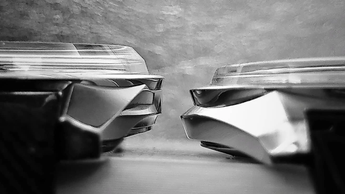
This is the decisive move.
Here I see Tanaka’s thinking at its most convincing: the outline, the apparent thickness and the behaviour of light are resolved together. His account explicitly connects the inward slope with reducing the visual weight of the case and clarifying its highlight line. In the steel 44GS, I find those concerns brought into an exceptionally coherent whole.
The line that used to describe an attached component now helps define the whole case. The lugs have expanded into the body of the watch, absorbing the familiar circular container into a continuous form. Seen from above, the long curve between the lug tips gives the case its own unmistakable outline. Seen from the side, the fold gives that outline depth and tension.
I find it extraordinary how little needs to change on paper for so much to change in the object. The earlier watch has already prepared the eye for the move. It takes real confidence to carry it through.
The bezel participates in the same transformation. On a conventional case, its junction with the body can look like a separate ring placed on top. In the 44GS, I read that junction as being absorbed into the movements of the profile. Case, bezel and the tall crystal above them make a sequence of slopes and counter-slopes. The crystal completes the gesture.
That is why I always want a side view. A frontal photograph can show the recognisable silhouette and still miss a great deal of the design. The 44GS has a wonderful to-and-fro movement in section, and its height is part of its ambition. Reduce it in your mind to an outline and something important disappears.
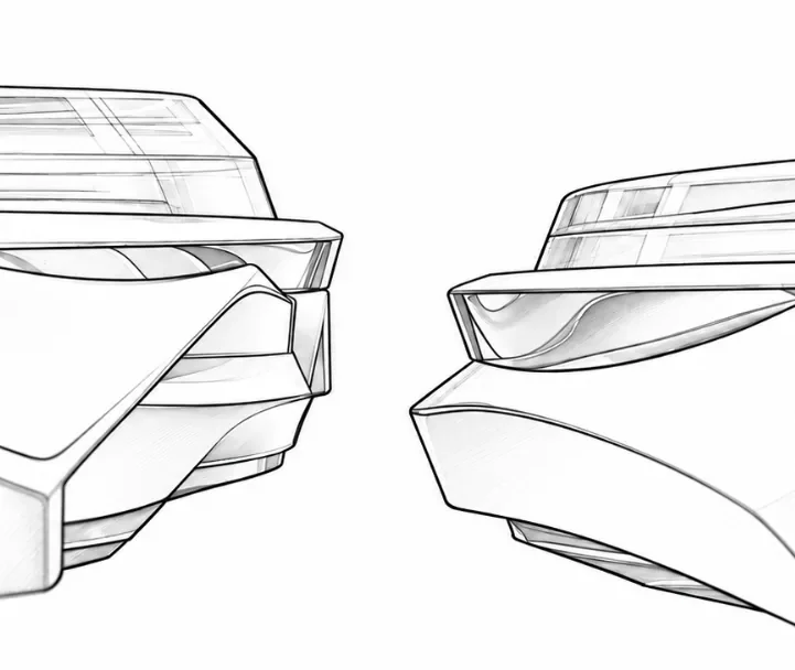
Then there is the straight edge between the lugs.
For me, this is indispensable to the whole idea. The curve of a round case no longer continues through the gap where the strap enters. Instead, the case ends in a straight connection, meeting the straight end of the strap with remarkable directness.
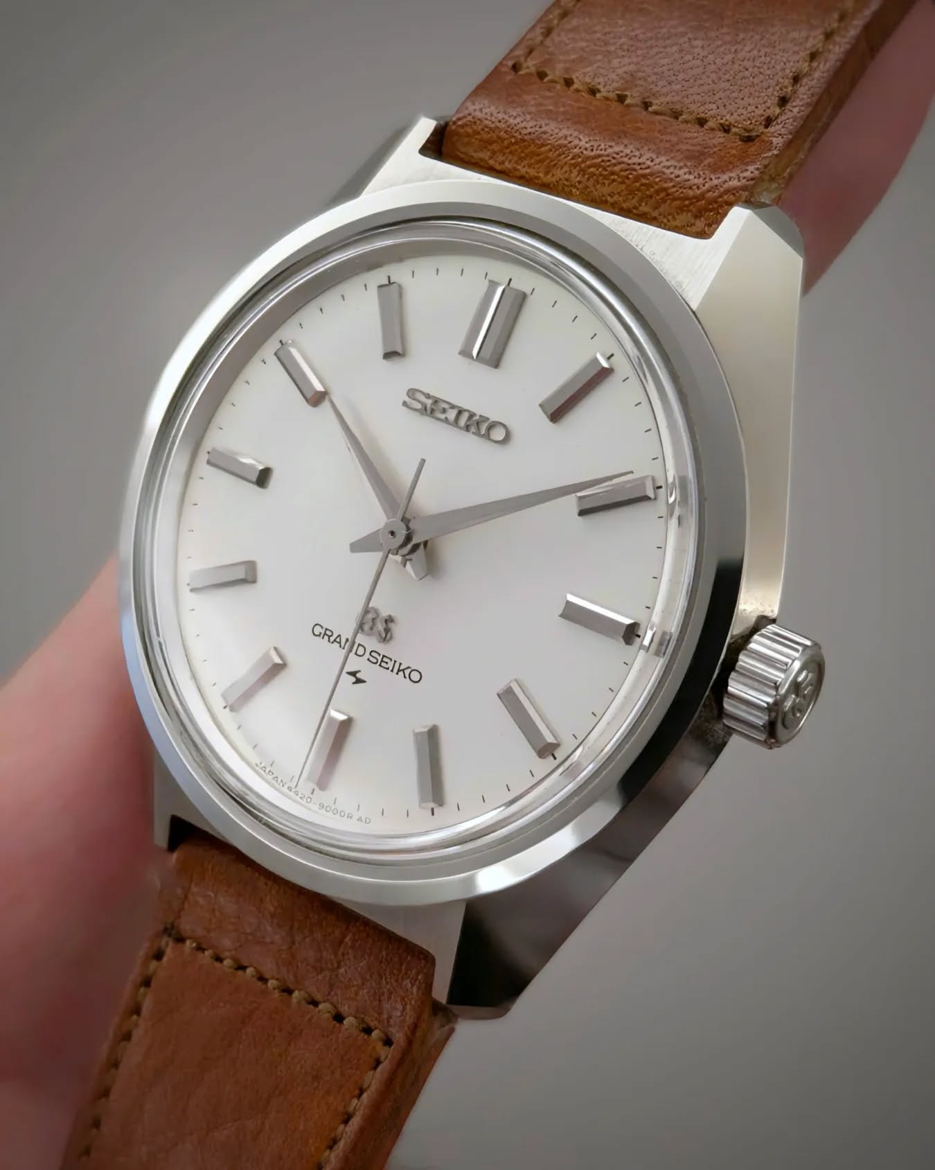
The relationship between watch and strap becomes part of the composition. The strap feels connected to the geometry of the case instead of simply being held between two projecting horns. The synthesis extends around the wrist.
This is where I think the 44GS achieves something exceptional. It brings case, lugs, bezel and strap connection into one coherent reading. Every element still performs its practical function, yet their junctions contribute to a larger shape. The completed watch looks wonderfully self-evident. Getting to that apparent simplicity is the difficult part.
44GS · the dial
A monument with room to breathe
The dial gives the steel 44GS the same sense of resolution.
I love the space around its indices. Their volume is clear, their rhythm is generous, and the continuous minute track between them and the bezel leaves them enough room to register as individual objects. The composition has an unusual calm considering how forcefully the case presents itself.
A comparison with my earlier-dial King Seiko Chronometer makes the difference especially clear. On that King, the relationship between markers, minute track and outward-flaring bezel makes the face seem to radiate beyond its own perimeter. The 44GS draws the composition into a more contained space. It feels centred and comfortable within its boundaries, while losing none of its monumental presence.
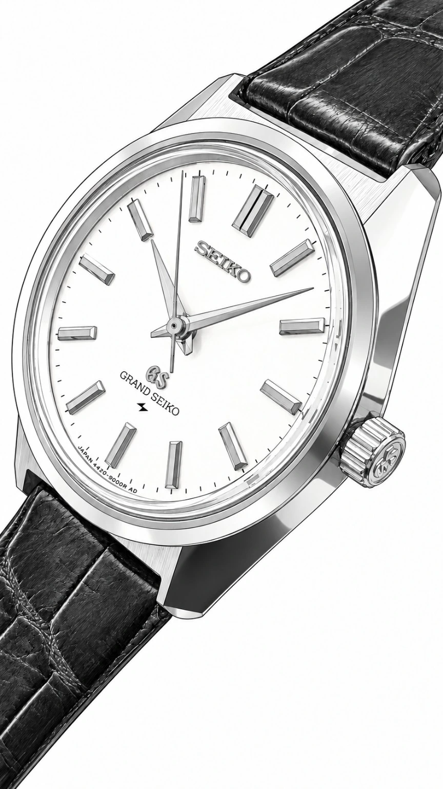
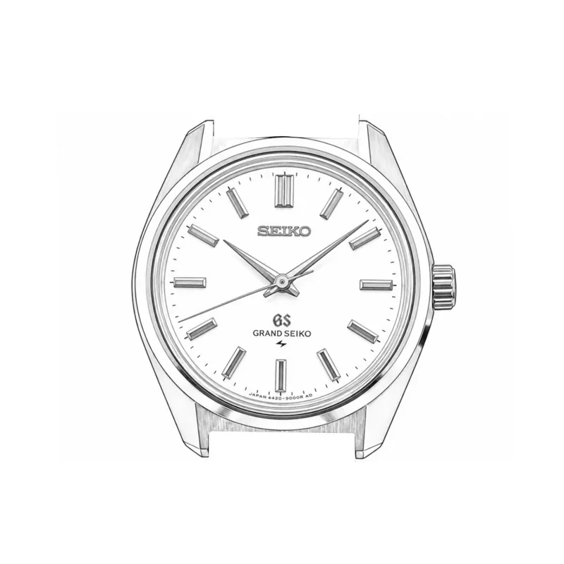
The dial comparison needs a little care because the late King Seiko Chronometer already moves towards the arrangement we associate with the Grand Seiko. Here too, the final watch gathers together ideas that are already emerging around it.
The steel 44GS allows polished metal and changing light to do a remarkable amount of work. Its markers have a strong, almost block-like clarity, and the absence of the black accents familiar from many later references gives the whole face an unusually continuous material character.
I find the result more compelling than a mechanically consistent application of rules. The relationships are right. The watch has enough complexity to remain fascinating and enough coherence to remain simple.
On the wrist it feels like a little monument. The height of the crystal, the generous dial and the span of those polished case surfaces give it a presence that the label “dress watch” does very little to explain. I wear these watches because I enjoy living with them, and the 44GS has a way of making an ordinary glance at the time rather less ordinary.
The line opens into a field
The point from which everything opens out
Looking back across the watches, I see a series of increasingly confident decisions.
The J14102E establishes the force of flat surfaces and controlled geometry. The 15034 strips away more of the ornamental vocabulary and gives that idea a remarkably assured voice. The second-generation Kings develop its volume, deepen the dial and broaden the lugs. The Chronometer brings the case and lugs close to a common outline. The steel 44GS completes the synthesis with its continuous fold and straight connection to the strap.
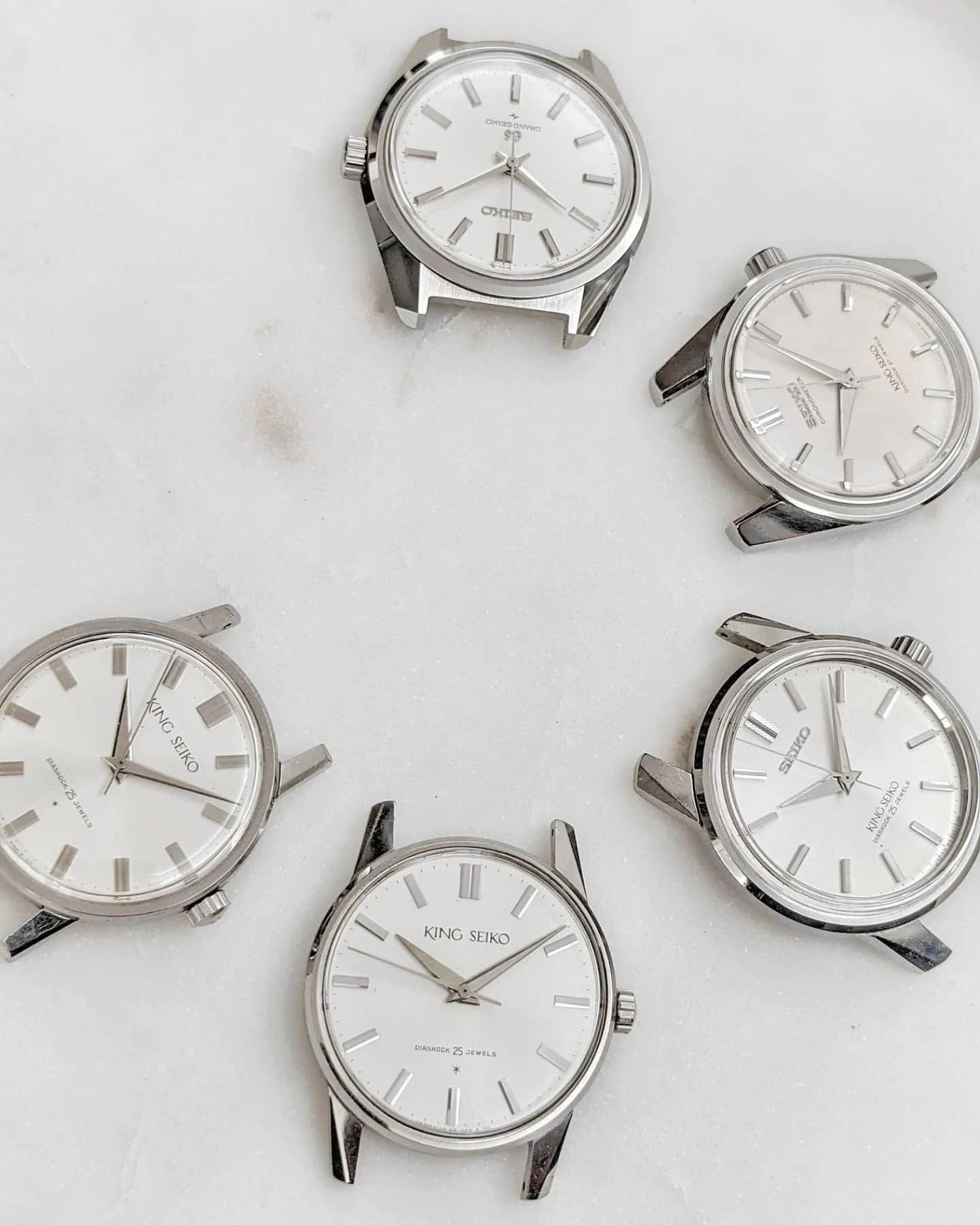
That is the backbone of my origin story. The Grammar of Design becomes much more interesting when I can follow its formation in the watches themselves, seeing each change and feeling its effect in my hand.
For me, the 44GS remains the summit of that particular pursuit. I have described it as the centre from which I observe the rest of the vintage King and Grand Seiko portfolio. That is a personal judgement, and a very deliberate one.
Beyond the 44GS, I follow a language that other designers could develop in their own ways. What interests me is how Tanaka’s principles survive that process: sometimes closely held, sometimes stretched, and sometimes transformed enough to give a watch a very different character. Those different movements, proportions and ways of wearing a watch give me plenty of reasons to keep collecting.
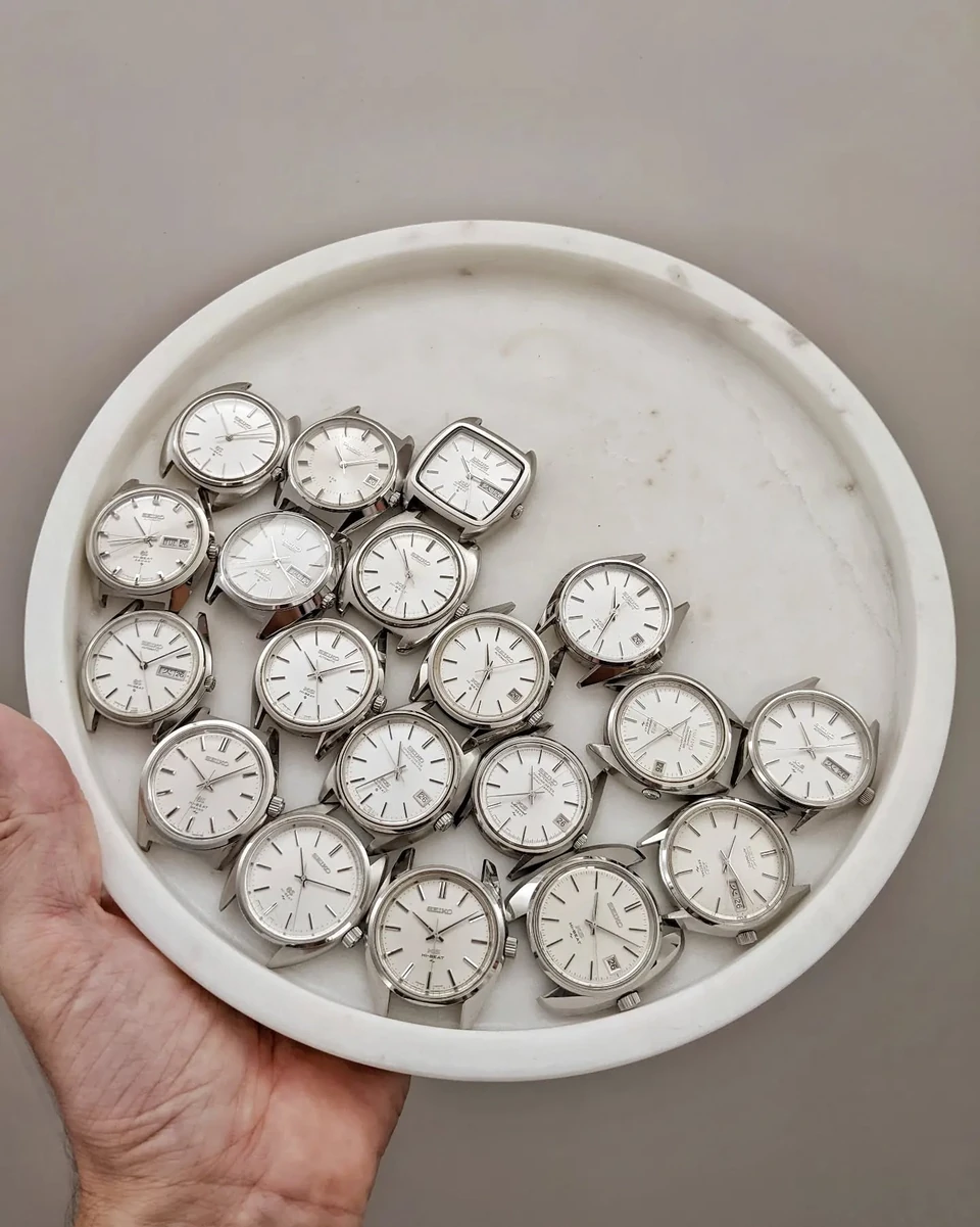
At that point, the line begins to open into a field.
But I keep coming back to the steel 44GS. After all the comparisons, all the photographs and all the time spent looking, it still makes me stop. The elements have come together with such clarity that the years of searching almost disappear into the finished object.
Put the early King Seikos beside it, and those years become visible again.