
44GS and 45GS: A change of character
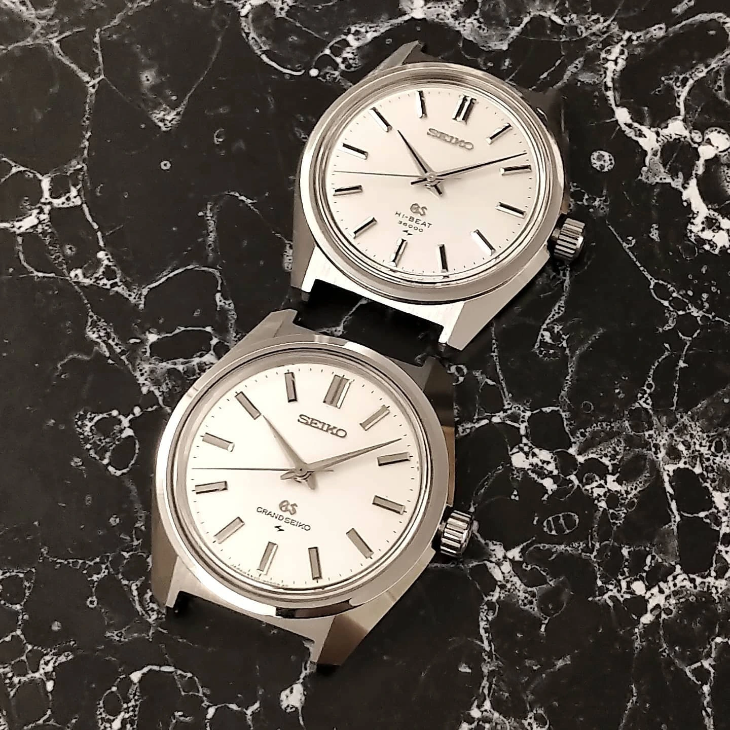
Put the steel 44GS beside the smaller 45GS, the 4520-8000. The family resemblance is immediate. Stay with them a little longer, though, and the difference in character becomes just as clear.
I find the 44GS expansive and almost monolithic. The 45GS is sharper, more compact and more agile. The two give me different reasons to stop and look.
Breadth and height
The 44GS spreads out generously around its dial. Its broad polished surfaces, flaring flanks and tall crystal give it a presence that the width alone does not explain. The silver hands and markers keep the face remarkably monochromatic; light supplies much of the contrast.
My measurements put the 44GS at about 38 mm across and 11 mm high, including the crystal. The 45GS was a little over 36 mm across and about 9 mm high. These are approximate measurements of my examples. The smaller watch’s entire case is close to the width of the 44GS bezel.
Viewed from the side, those two millimetres of height are very visible. The tall crystal is a substantial part of the 44GS composition. The 45GS sits lower, and the relationship between its bezel, crystal and case is more compressed. Its planes still meet decisively, but the whole watch has a leaner presence.
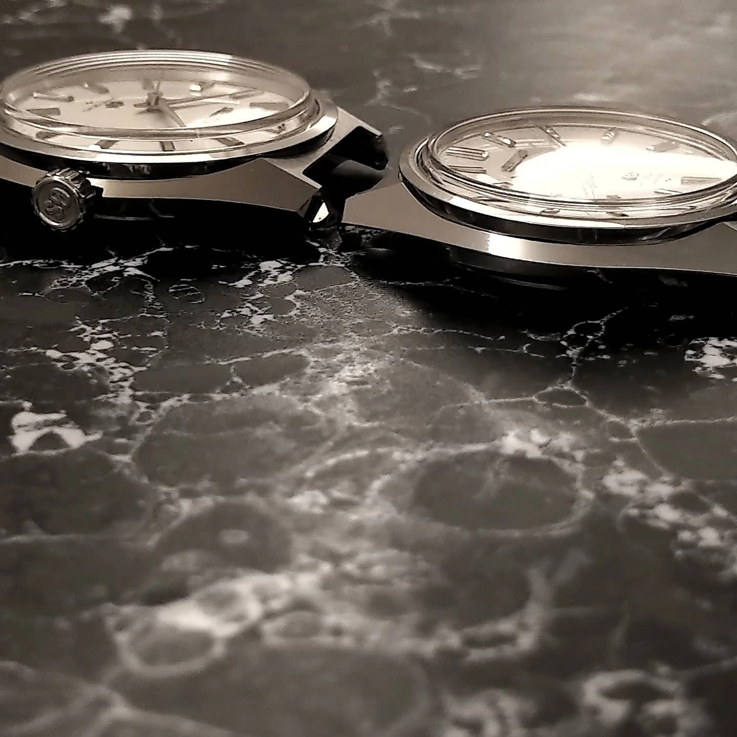
A different contrast across the dial
The long black markings on the 45GS hands and indices change the face immediately. They give it a more graphic, purposeful expression. Beside it, the broad silver elements of the 44GS seem quieter and more continuous with the polished case.
The change reaches across the whole object: proportions, case, hands and dial. In my earlier comparison I called the 45GS the sharp, elegant and agile sibling. It still feels like the right description.
The watch, the method and the style
I find it useful to keep three things distinct. The 44GS is the particular watch discussed here: the steel 4420-9000. The Grammar of Design is the method. Grand Seiko Style is the wider language that can emerge from it.
That distinction leaves room for the 45GS to have its own identity. I can recognise the shared principles in its flat surfaces, clear junctions and handling of light, while seeing how thoroughly its proportions and details have changed the result.
The 44GS remains the reference point in my origin story. The 45GS shows how that language can continue in a more compact, contrasting expression. That is why I keep both.