
The cap-gold conundrum
The stainless steel 44GS, reference 4420-9000, brings the case, lugs and bezel into one continuous composition. Its cap-gold counterpart, reference 4420-9990, has a substantially different case expression. Its close resemblance to the King Seiko Chronometer makes it a fascinating companion to the steel 4420-9000.
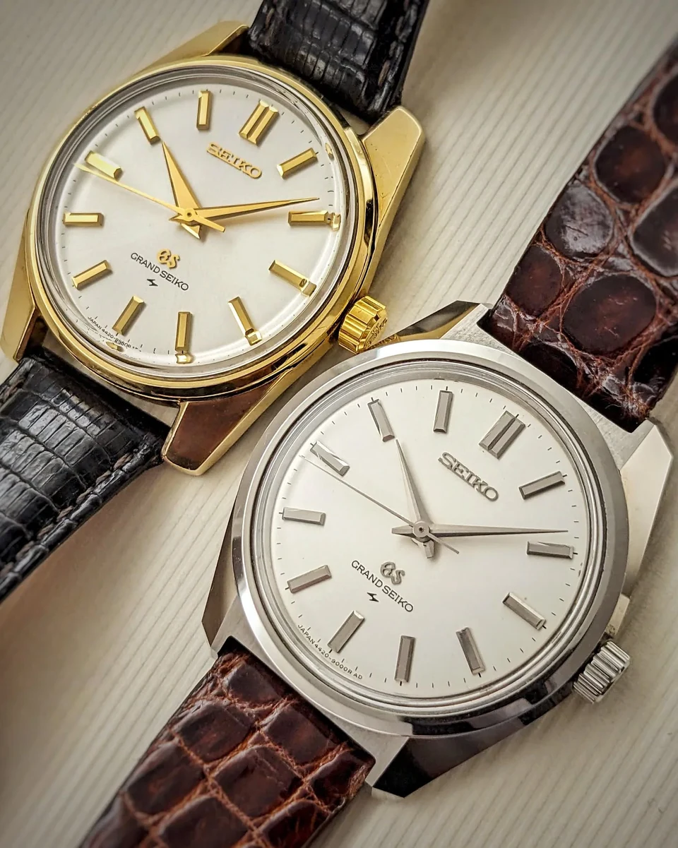
My specimens: February 1968 and August 1967 respectively.
On the steel watch, the lower flank turns inward beneath the case's widest line. That return gives the broad upper surface an unexpectedly light edge: a blade of shadow beneath a plane of light. The cap-gold case retains a fuller, more rounded outline.
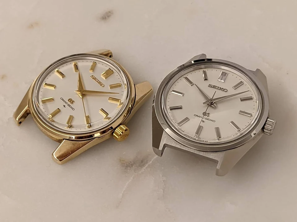
My working theory concerns the gold cap itself. Imagine fitting a formed gold cover over the supporting case from the dial side. Bringing its lower edge inward beneath that widest line seems a more difficult proposition. I suspect the material and construction helped determine why the cap-gold 44GS stayed closer to the earlier case architecture. I have no factory documentation for that explanation; it is a reconstruction from the watches in front of me.
To my eye, the 61GS, 45GS and 56GS evolutions of the cap-gold construction look for ways to approximate the elegant steel solution.
61GS: a fuller flank
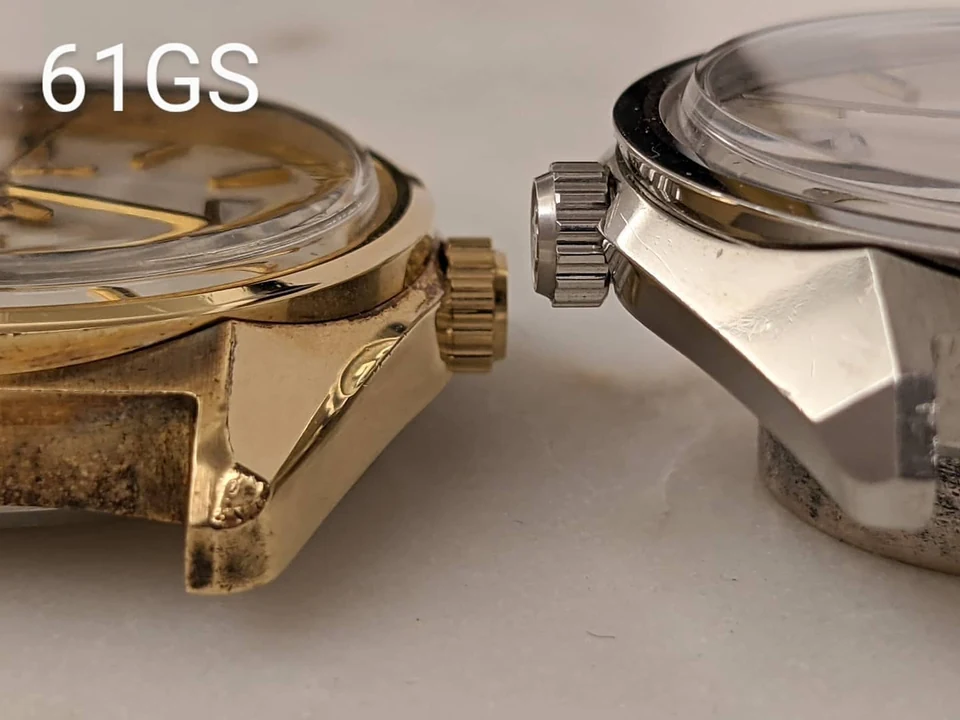
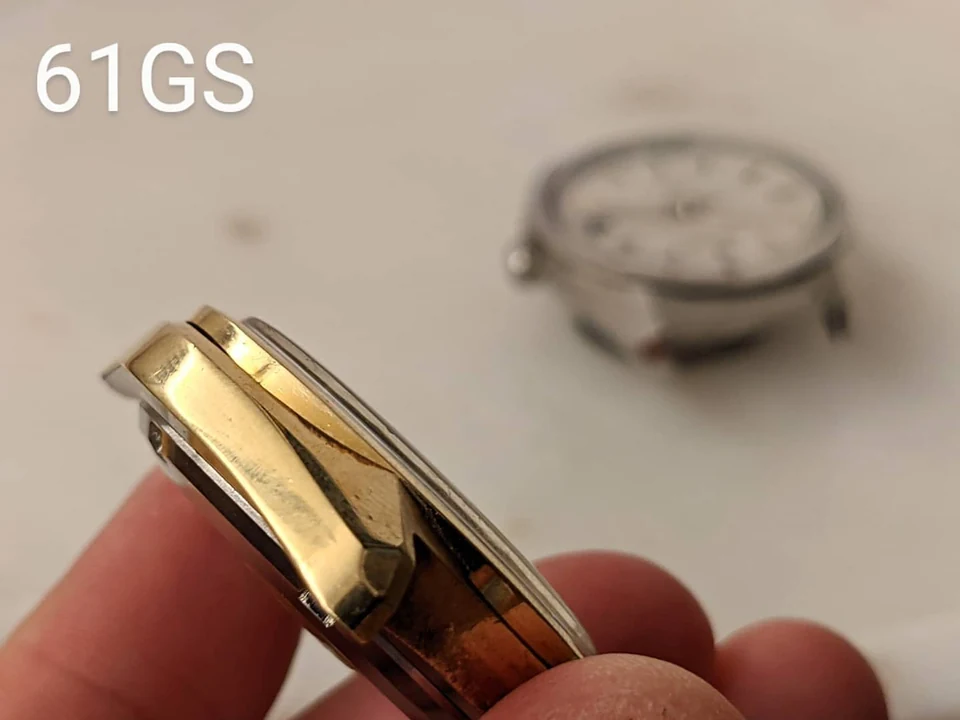
Suwa's 61GS gives me the first useful comparison. On the steel 6145-8000, the case flank folds back inward below its central ridge. The cap-gold version keeps a ridge, but the surface beneath it drops vertically towards the bottom of the case.
That ridge also sits higher and closer to the centre of the watch. The lithe waist of the steel case becomes a fuller golden base. I read this as a compromise that preserves much of the upper geometry while giving the gold cap a simpler lower edge to follow.
45GS: the inward edge returns
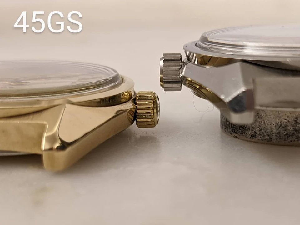
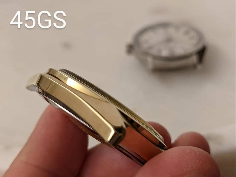
Daini's 45GS brings the lower edge back into the discussion. Comparing the steel and cap-gold 452x-8000 cases, I can see an inward return at the bottom of the golden flank. It is less emphatic than on the steel watch, but it restores something of that undercut and the lightness it creates.
I imagine the lower edge of the gold cap being worked inward around its supporting case. That is a possible account of the making, rather than a process I can document. What I can see is the result: the gold case has acquired a more articulated lower edge, and its silhouette comes closer to the steel expression.
56GS: finding the shadow in the finish
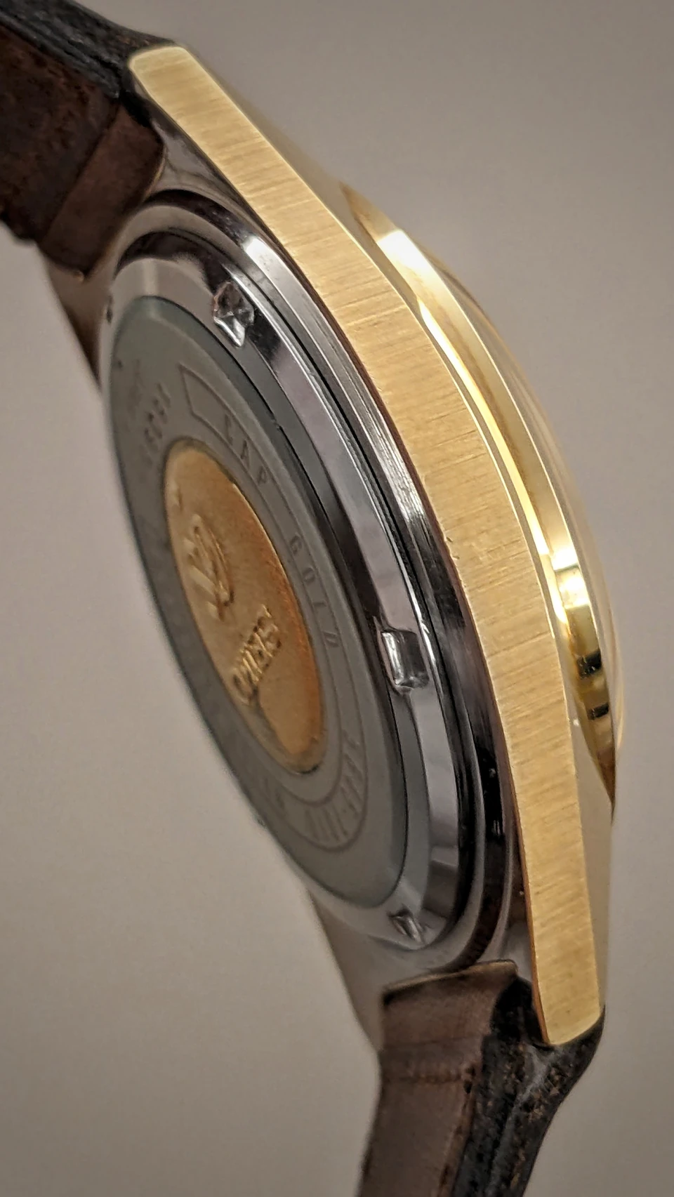
The 5645-7010 cap-gold 56GS gives me another way of looking at the problem. Its lower case flanks remain vertical, but they are brushed. The cap-gold 61GS and 45GS shown above keep those surfaces polished.
For me, that change in finish is the intriguing part. Brushing can make the vertical flank read as a quieter, darker surface beneath the bright upper planes. I see it as a further attempt to recover the blade of shadow made by the inward slope of the steel case. The geometry and the finish offer different routes towards a related visual effect.
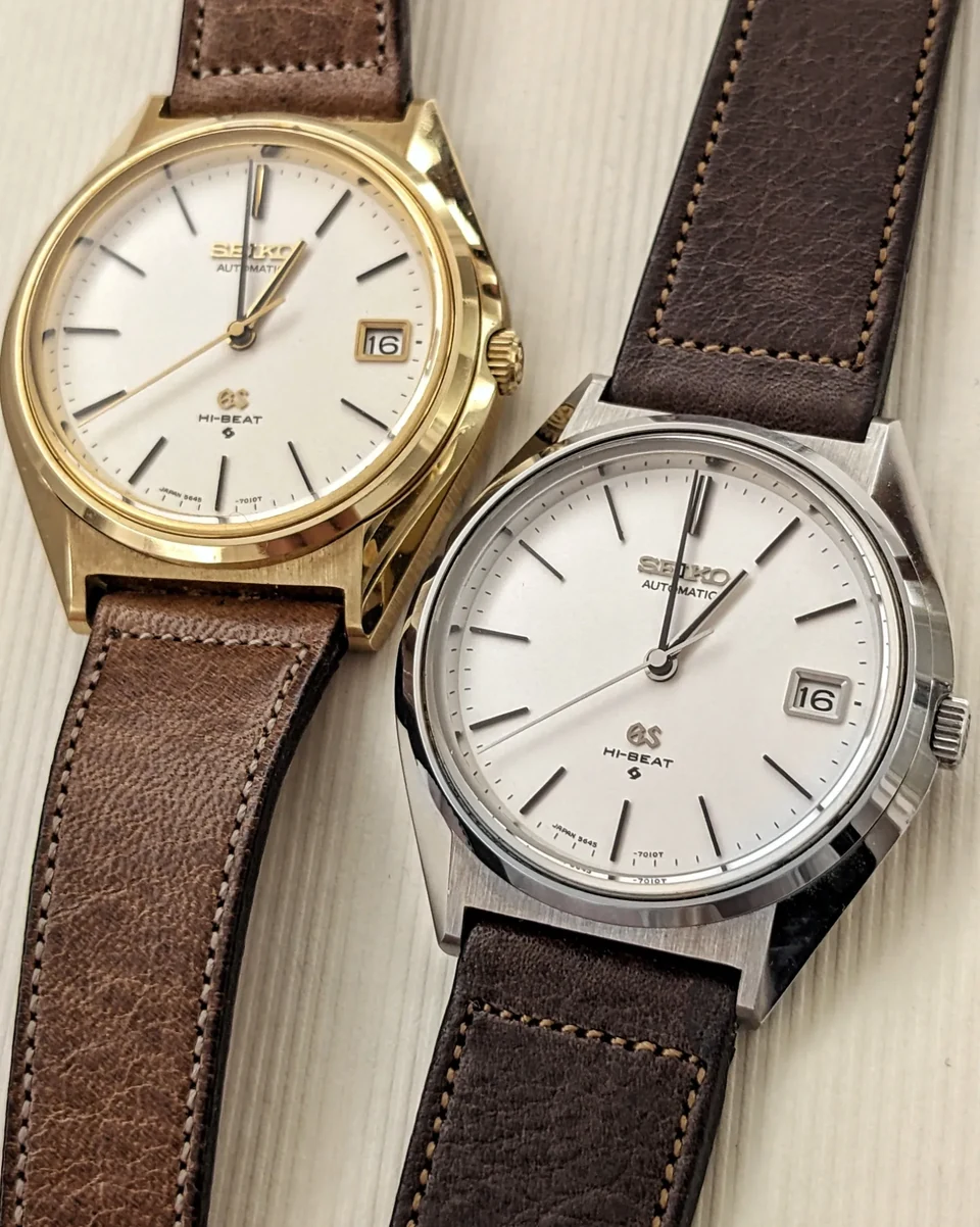
My specimens: August 1971 and September 1973 respectively.
This is how I see the cap-gold conundrum gradually finding answers: a fuller vertical flank, a returning inward edge, and a finish that changes the way a surface catches the light. I find that progression fascinating because it brings the design back into contact with making. A shape has to be realised in a material, finished, assembled and repeated.
When I talk about the culmination of the origin story, I still mean the stainless steel 4420-9000 and its folded case architecture. These cap-gold comparisons show how the same pursuit could continue through different constructions and surfaces.